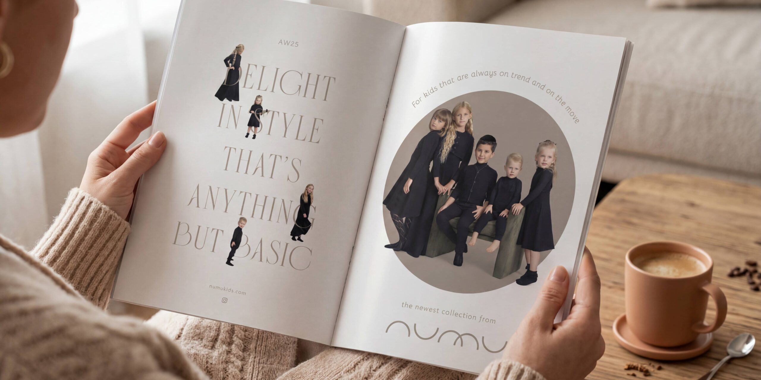
For kids that are always on trend and on the move.
The challenge
In a market saturated by children’s clothing brands competing for attention, Numu had something different in mind. They envisioned something easier, simpler and smarter. A line of comfortable, versatile mix-and-match essentials that enhance every child’s wardrobe. Basics that are anything but boring.
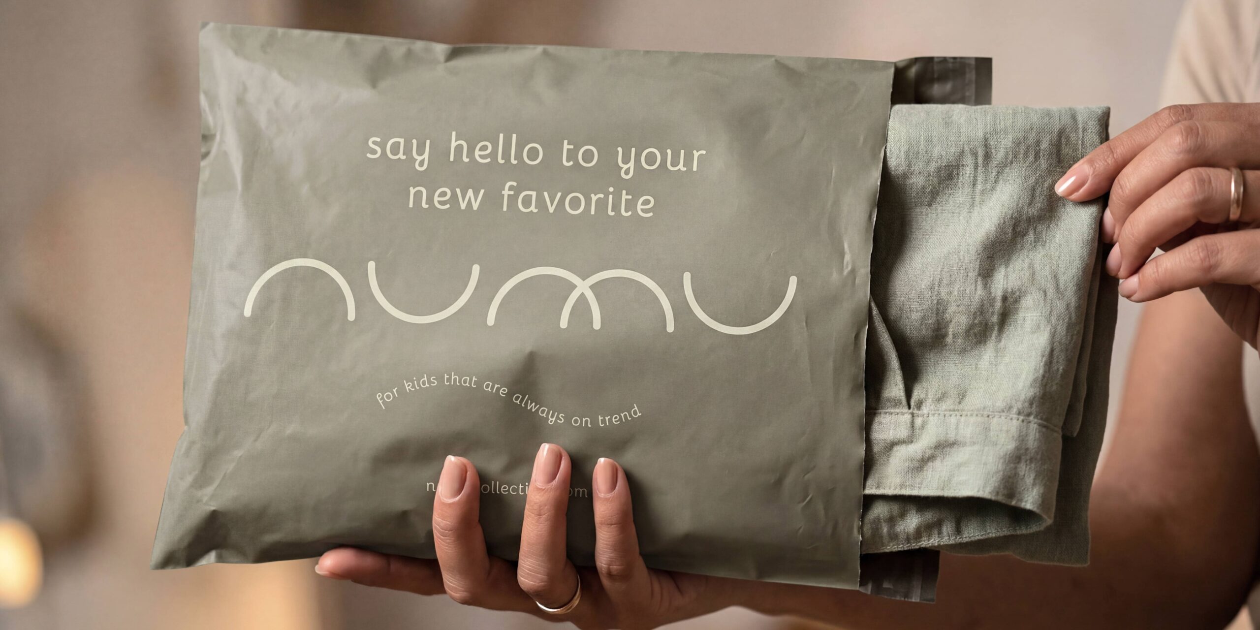
From the name, to the packaging, and even the campaigns, our task was to build a brand that felt effortless from day one.
The process
We started where every strong brand begins. With meaning. Not in what’s being said, but in what’s being felt.
The naming process was a deep exploration of tone and texture. Delving into how a name sounds when spoken, how it looks when written, and how it makes you feel when you see it on a tag. We explored endless options, but the right one didn’t sound like anything else. It was soft, balanced, and clean.
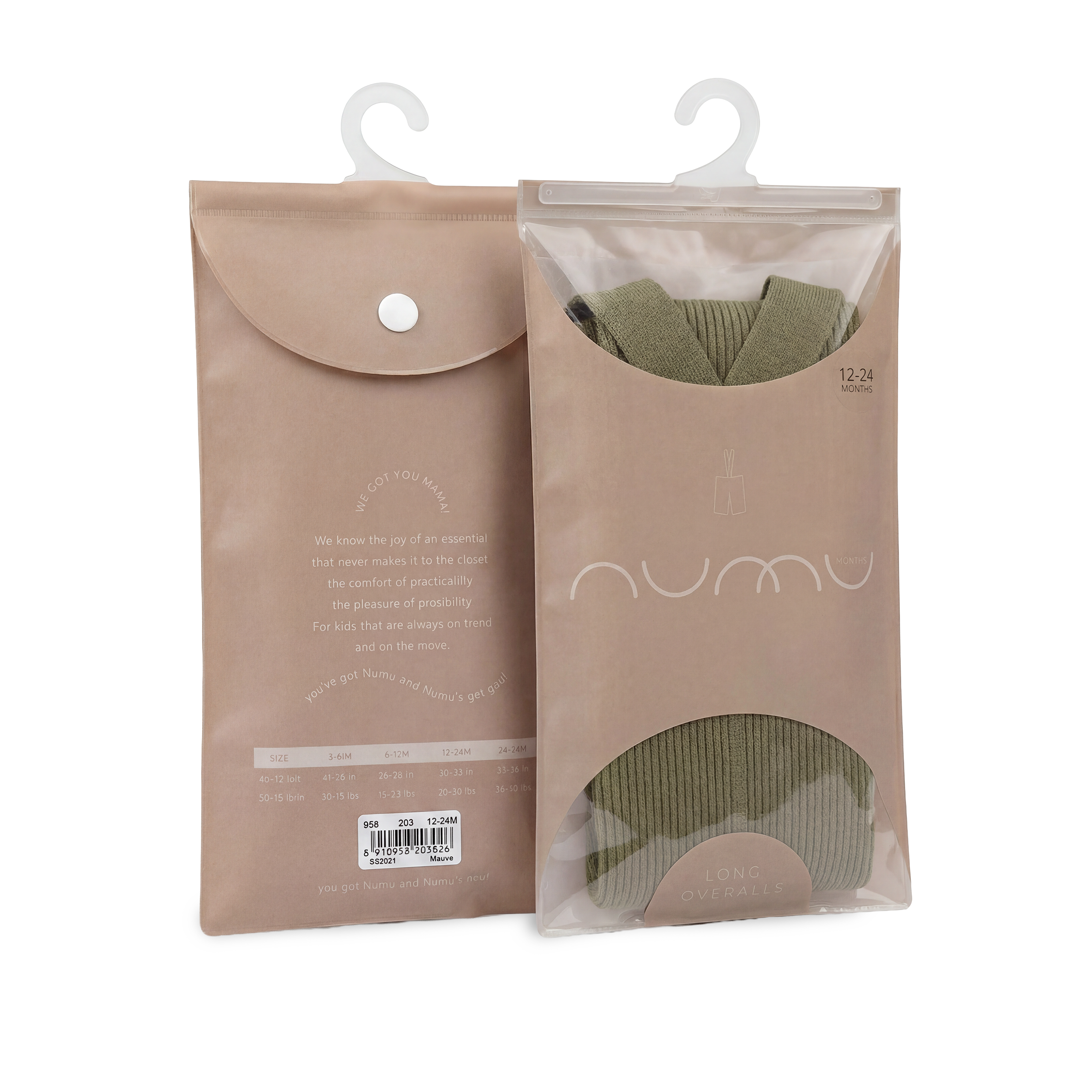
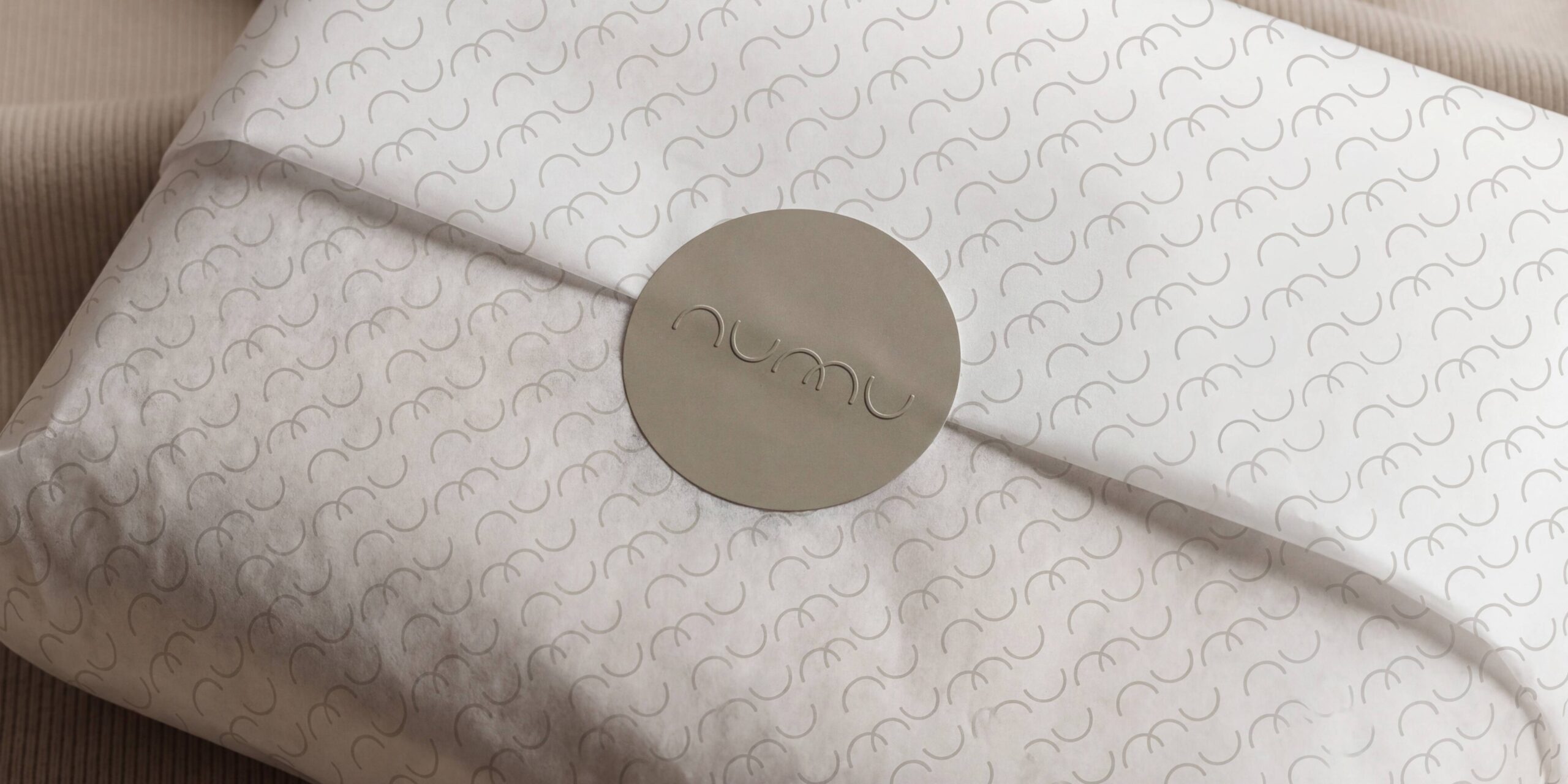
Numu wasn’t pulled from a word list, instead it was shaped from sound. A name with no existing meaning, ready to be defined entirely by the brand itself. Its flowing phonetics make it warm and approachable. Its mirrored structure (nu / mu) giving it a built-in symmetry. Resulting in the kind of quiet visual balance that makes great logos timeless.
The approach
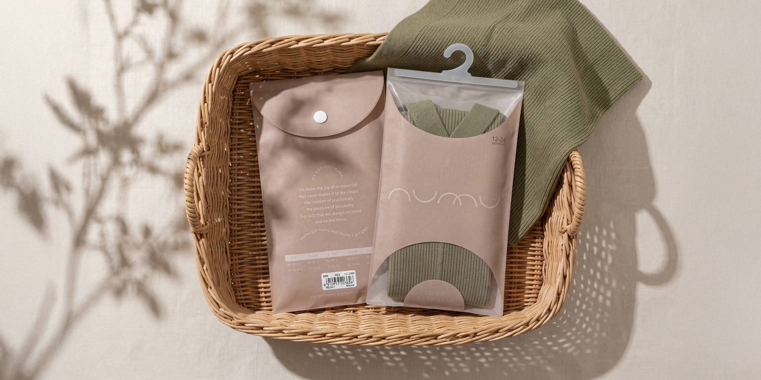
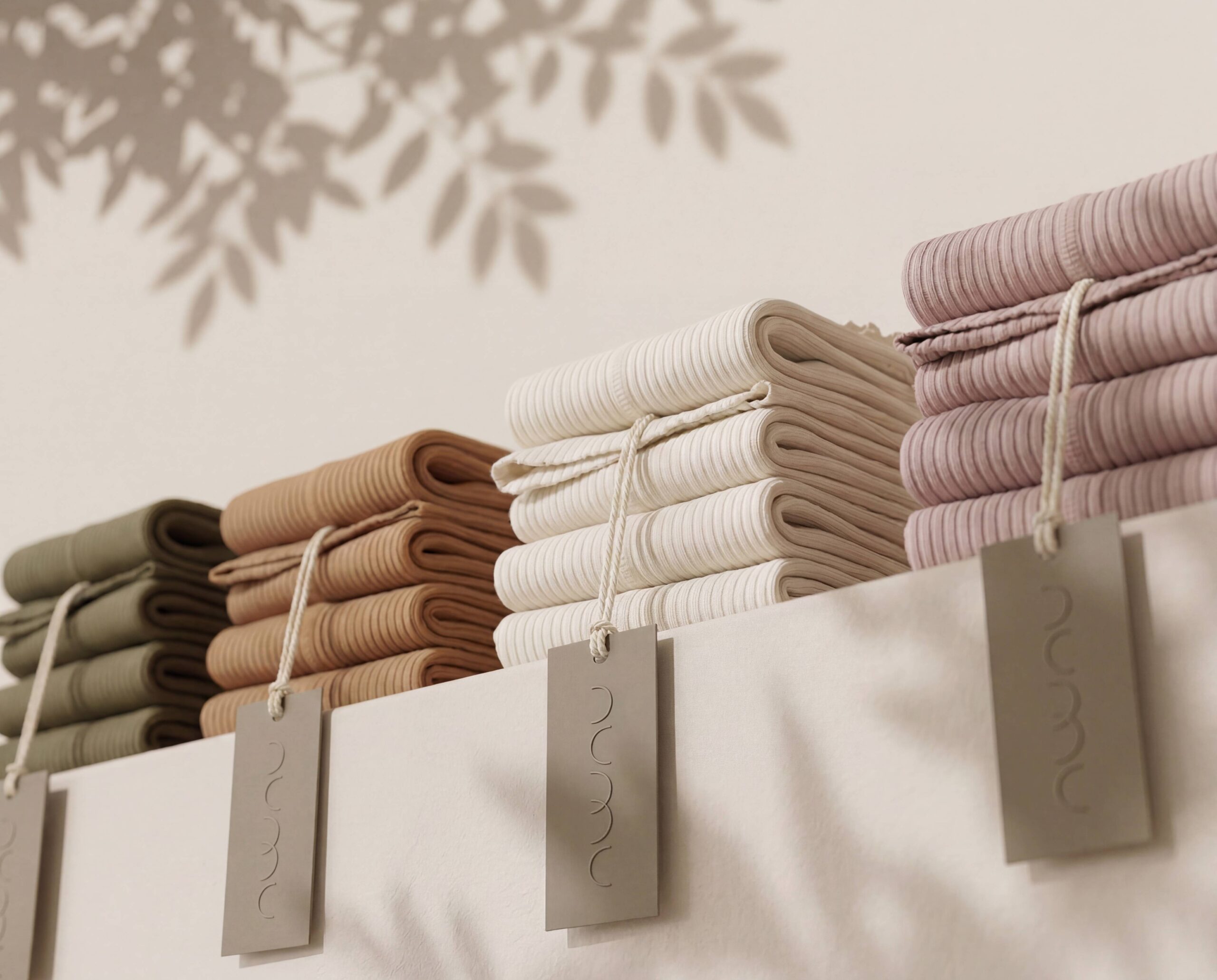
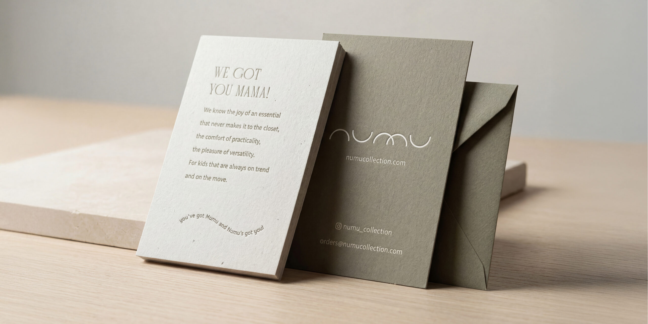
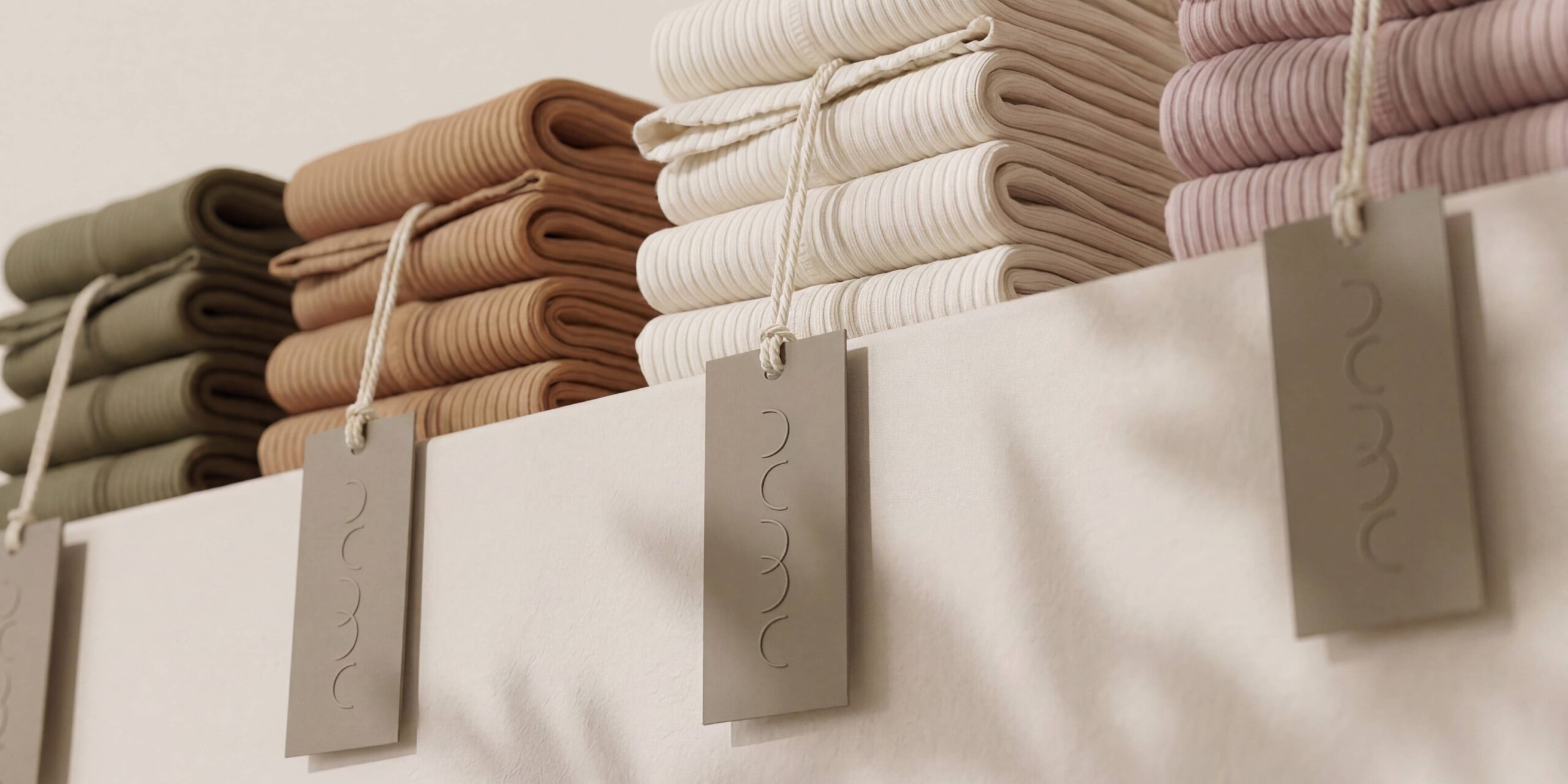
The identity draws on minimalism but avoids sterility. Conveying warmth without clutter. The palette is soft, sophisticated, and subtle with typography that’s modern but friendly. The tone of voice? Effortless, human, and reassuring. Lines like “You’ve got Numu, and Numu’s got you” and “We got you, Mama” position the brand as an ally — not only for kids, but for the parents who dress them.
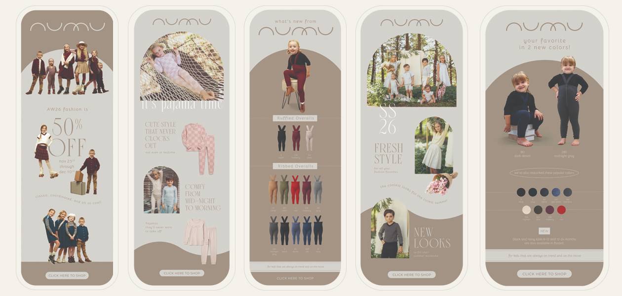
Every element was crafted with restraint. Maintaining the minimalist aesthetic that has become synonymous with the Numu brand along with the arches and curves that are a nod to the brand identity.
THE RESULTS
What began as an idea became a brand that felt established from day one.
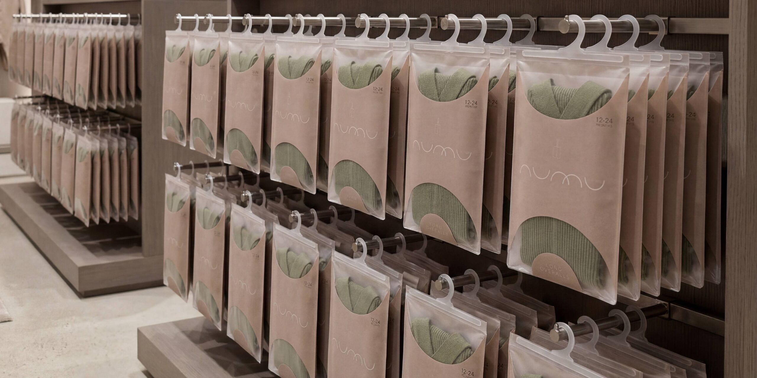
Numu launched into a competitive market and immediately stood apart. Recognized for its modern simplicity, emotional warmth, and cohesive voice. Its visual identity and tone established instant credibility among boutique buyers and parents alike.
The name that once meant nothing now carries everything.